Turning Design Tokens into Kuda's Shared Design Language
As Kuda's design team grew to 15 people distributed across multiple product squads, the design system struggled to keep up. Designers were bypassing tokens, dark mode was a maintenance nightmare, and color decisions were inconsistent across teams. I led a comprehensive token overhaul that introduced a multi-brand, multi-mode token architecture and shifted tokens from an optional convention to the team's default shared language.
Background
Kuda operates two core products: Retail, the consumer banking app, and Business, the product for SMEs. Both are served by a single design team, which had grown significantly by the time I joined.
When I joined as a Product Designer, the design system had a real foundation. Components existed, and some tokens had been set up. But as I started working within it, I noticed the system relied heavily on Figma Styles rather than a proper token architecture, which meant token adoption was inconsistent across the team. The token coverage also wasn't extensive enough to support everything designers needed day to day. Dark mode was particularly painful; designers had to manually change colors across a duplicate version of every design. As the team and product continued to grow, there was a clear opportunity to take the system further.
The problem
Designers across the team were still reaching for raw hex values and primitive styles like blue-100 or #FFFFFF instead of semantic design tokens. This wasn't laziness. It was a signal that the system wasn't making the right choice obvious enough.
The specific pain points we identified:
- No semantic layer. The system leaned on Styles rather than a proper token architecture, so there was no way to understand what a color was for, not just what it was
- Ambiguous decision-making. With 15 designers across different product areas, there was no shared reference point. New joiners, myself included, had no clear guidance on which values to use and when
- Dark mode as overhead. There was no proper dark mode infrastructure. Designers had to duplicate entire designs and manually change colors every time
- Inconsistency across design and engineering. The problem wasn't limited to design. Engineers were working with a mix of hardcoded hex values and tokens in the codebase, which meant inconsistencies were making their way into the product itself
- Accumulating design debt. Older files and components hadn't been updated, so picking up an old file could mean propagating outdated values
My role
I identified the gaps in the system shortly after joining and took ownership of improving it. I led the design system team alongside Mano, Great, and Ameerah through the full token overhaul.
My responsibilities covered the audit, token architecture decisions, Figma implementation, and organizing the team education sessions that drove adoption.
Goals
The overhaul was guided by a few clear objectives:
- Replace primitive token usage with a semantic token layer that communicates intent, not just value
- Build a token structure that supports both the Retail and Business brands from a single source of truth
- Implement light and dark mode through Figma Variables, eliminating the need to duplicate designs and manually swap colors
- Improve adoption across the design team by making the right choice the easy choice
The process
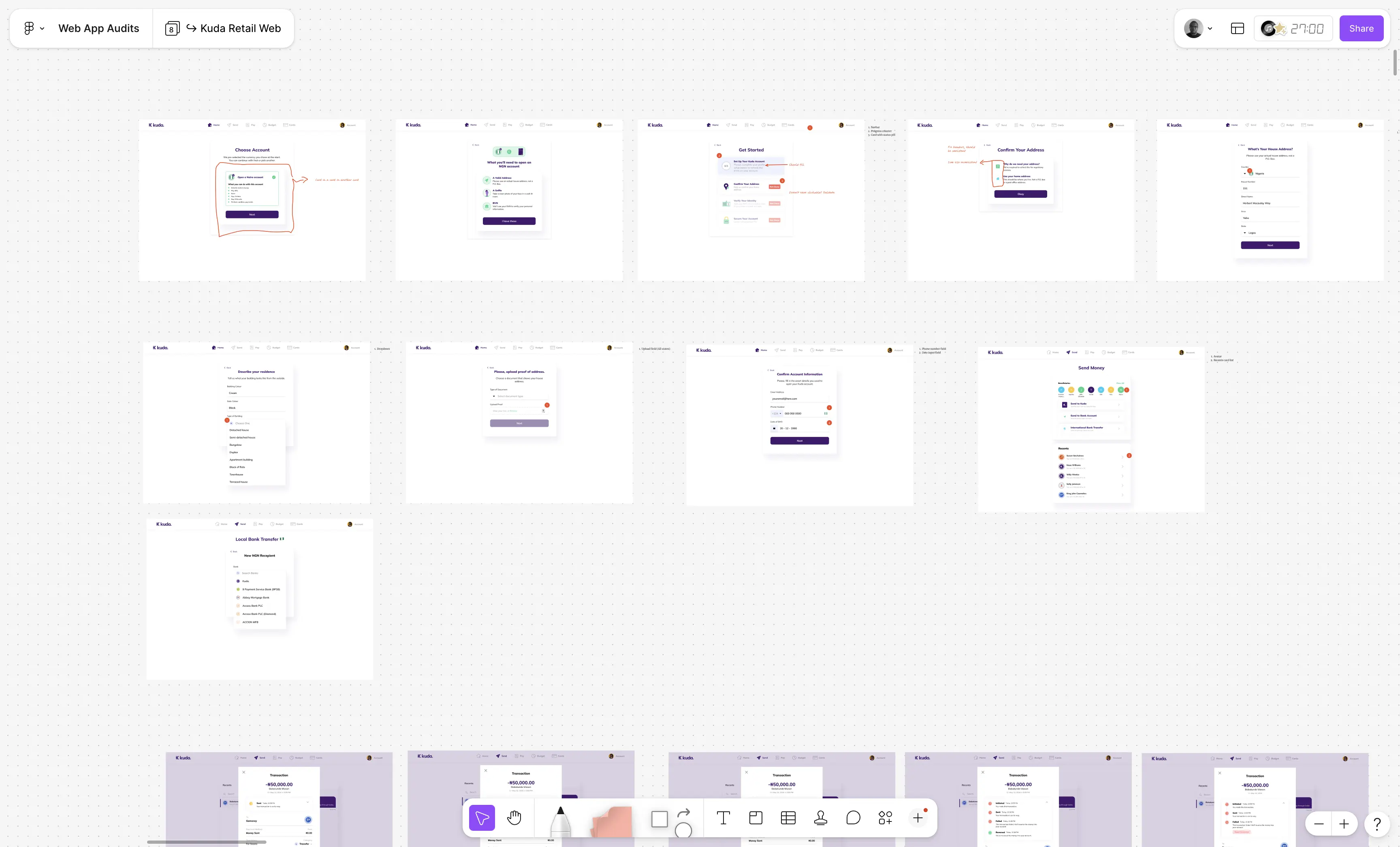
Auditing what we had
Before making any changes, we mapped how design properties were actually being applied across both brands. This gave us a clear picture of where the inconsistencies were, what patterns existed worth keeping, and where the biggest adoption gaps were.
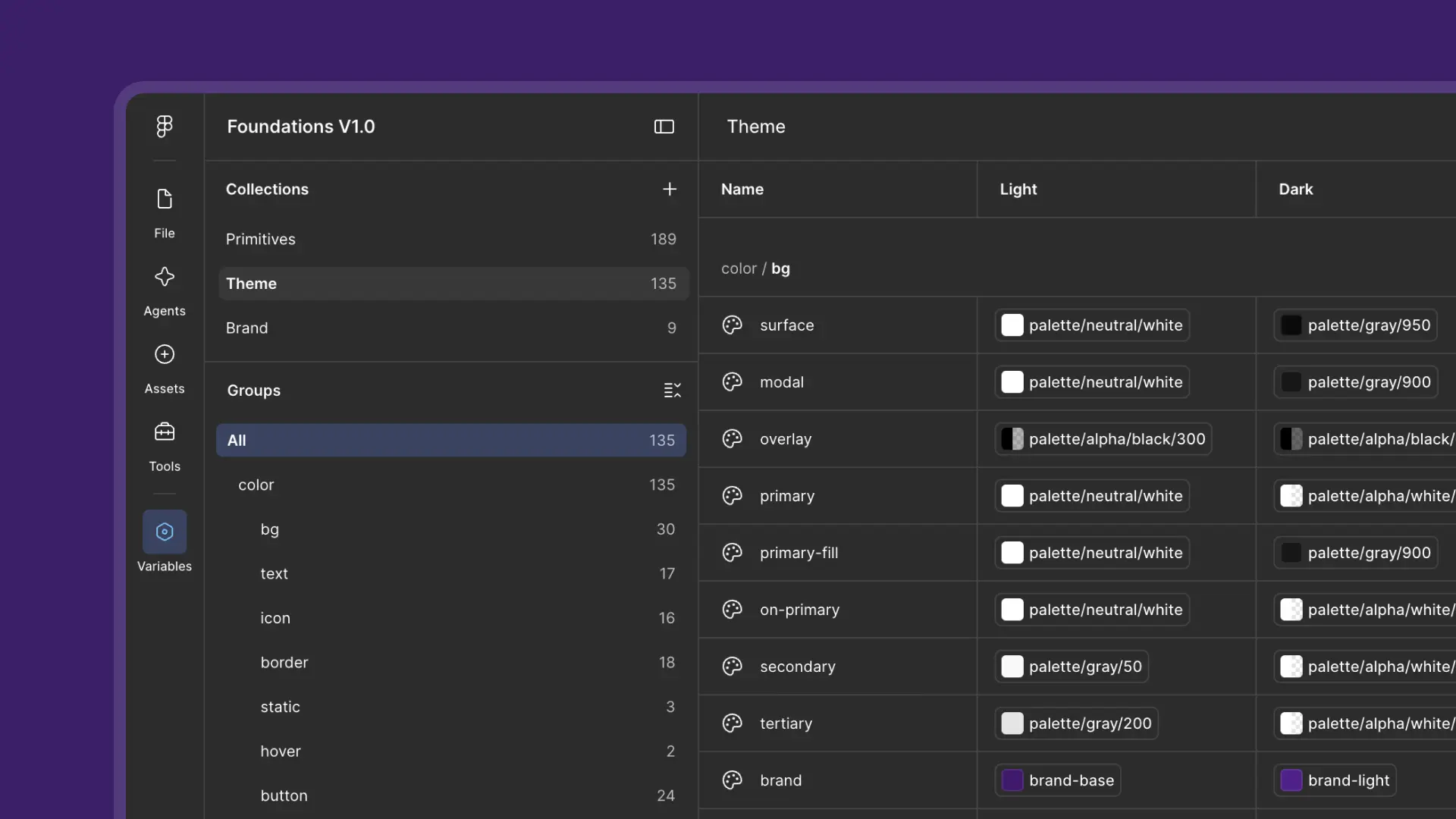
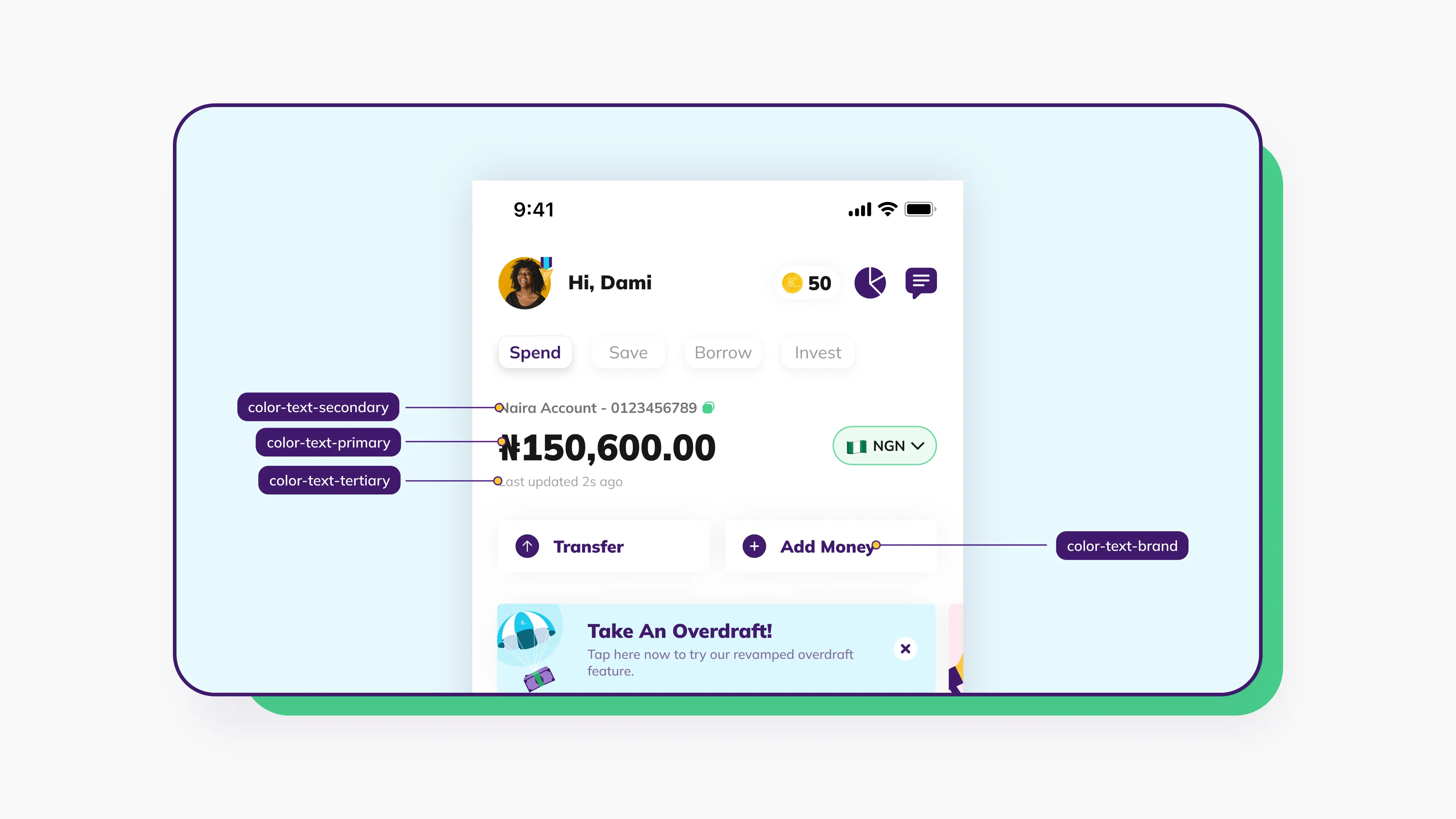
Building a semantic token layer
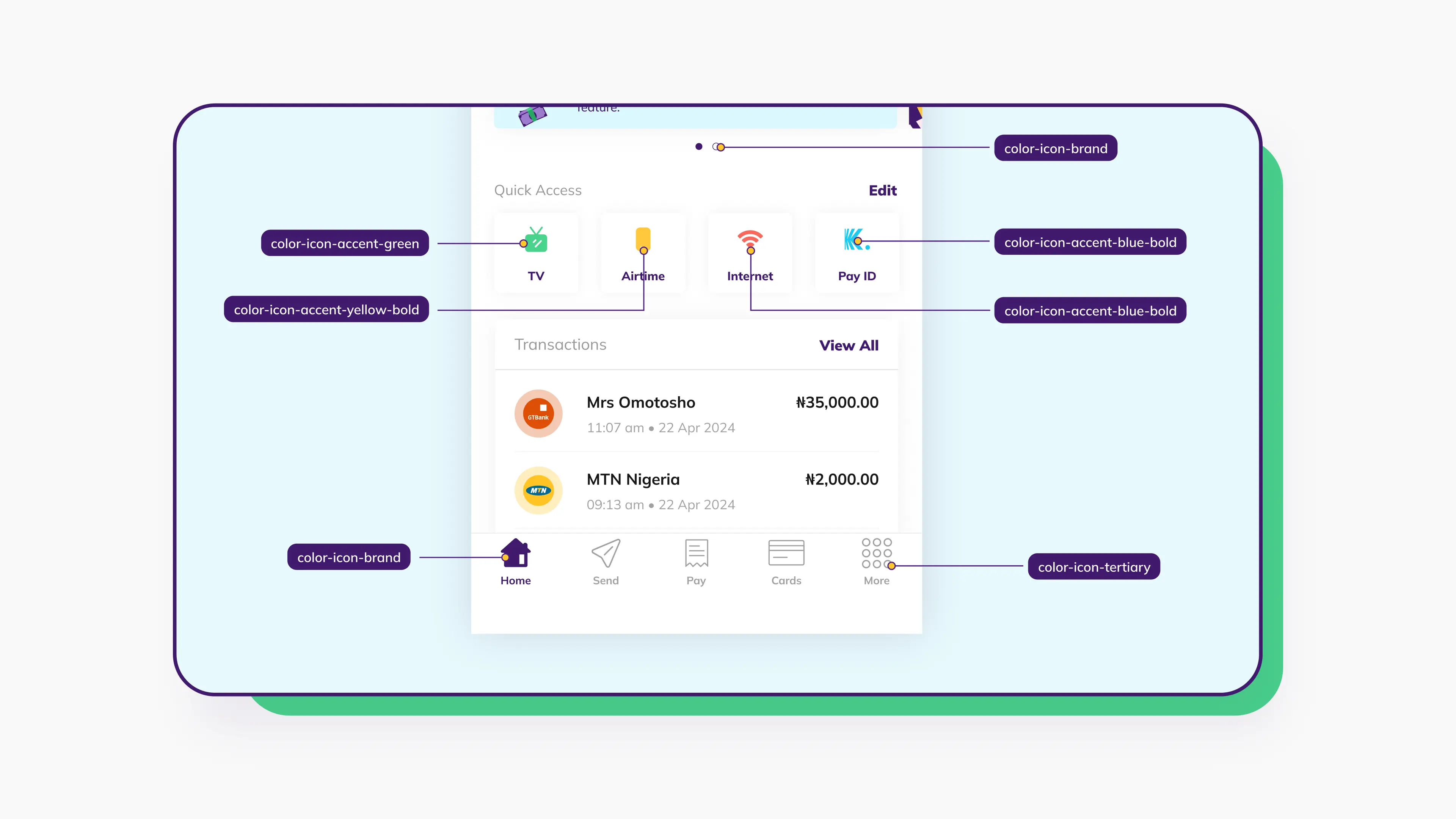
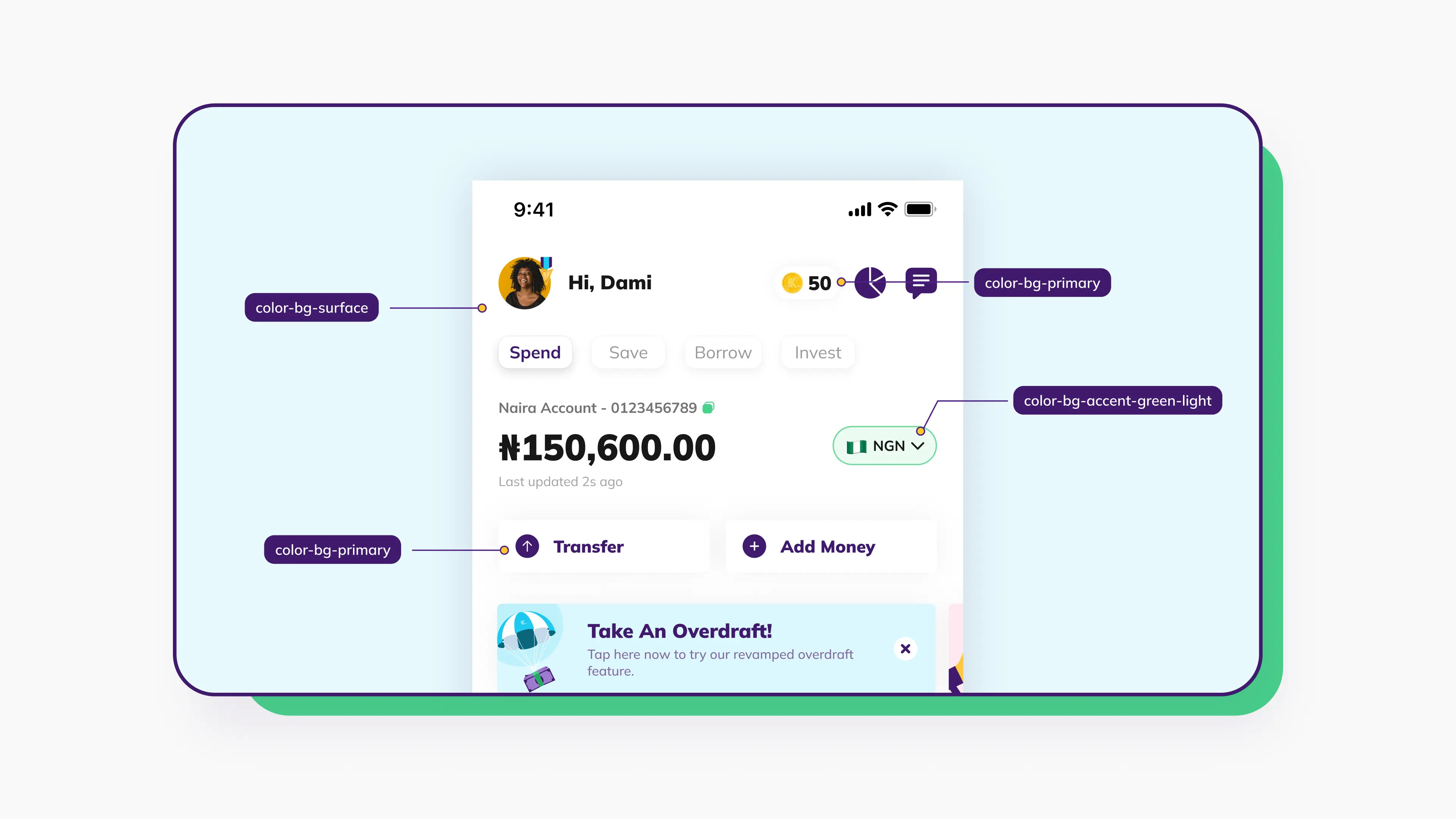
We extended and restructured the existing token system to introduce a clear semantic layer sitting above primitives. Rather than using blue-500 directly in a component, designers would reference color.action.primary, a token that carries meaning and can be remapped across brands and modes without touching the components themselves.
We also extended token coverage beyond color, which tends to get all the attention. The full token set covered:
- Color — semantic tokens mapped across Retail and Business
- Typography — family, size, weight, line height, and letter spacing
- Spacing — a consistent scale applied across components
- Border radius — standardized corner values
Designing for two brands
Kuda's Retail and Business products share a team but have distinct visual identities. We needed a token structure flexible enough to accommodate both without splitting into two separate unmaintainable systems.
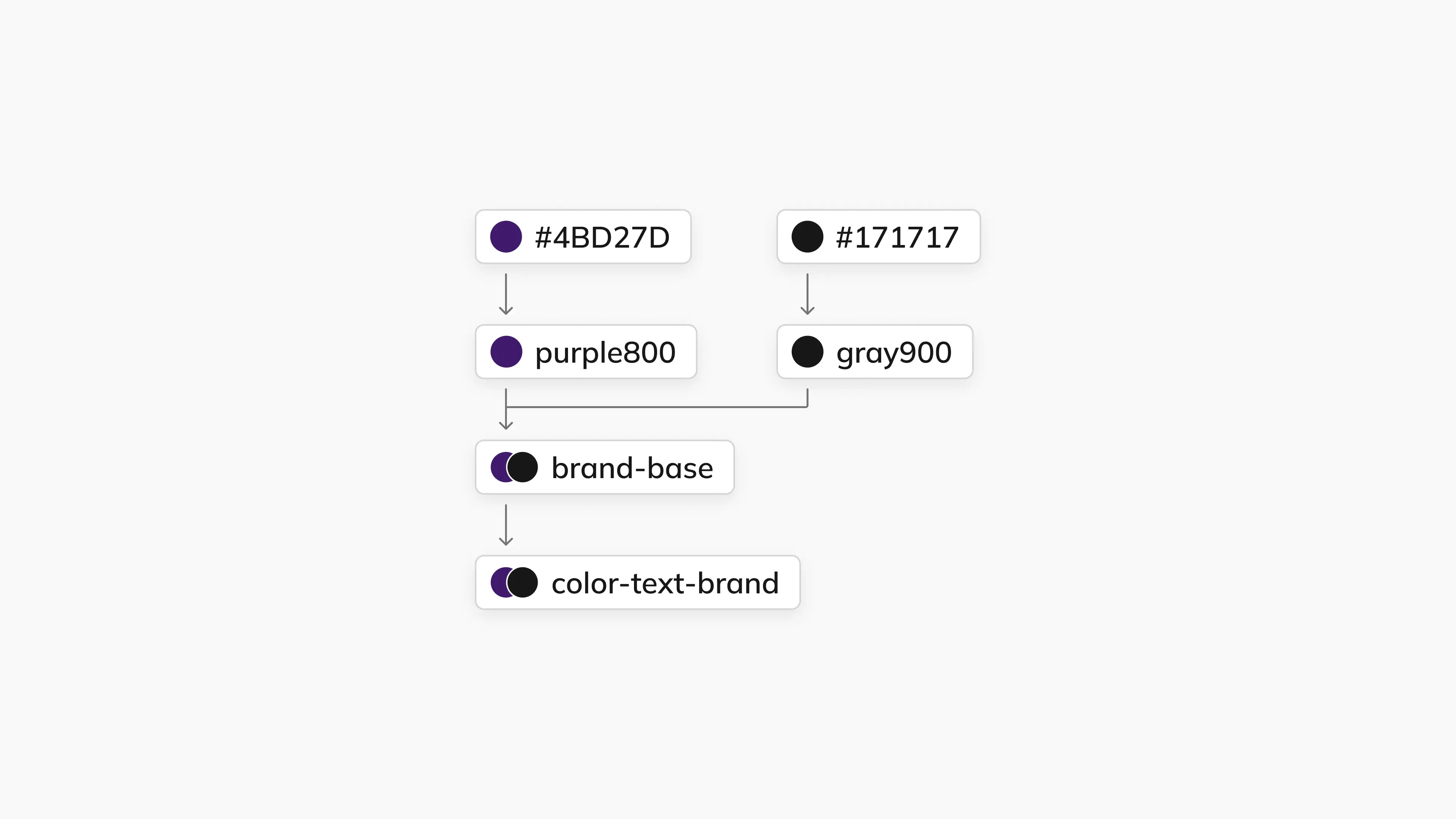
We studied how companies like Microsoft and Atlassian handled multi-brand token systems, then built a layered architecture. Primitive tokens fed into brand-specific collections for Retail and Business. Those brand collections then fed into the theme layer, which handled Light and Dark mode.
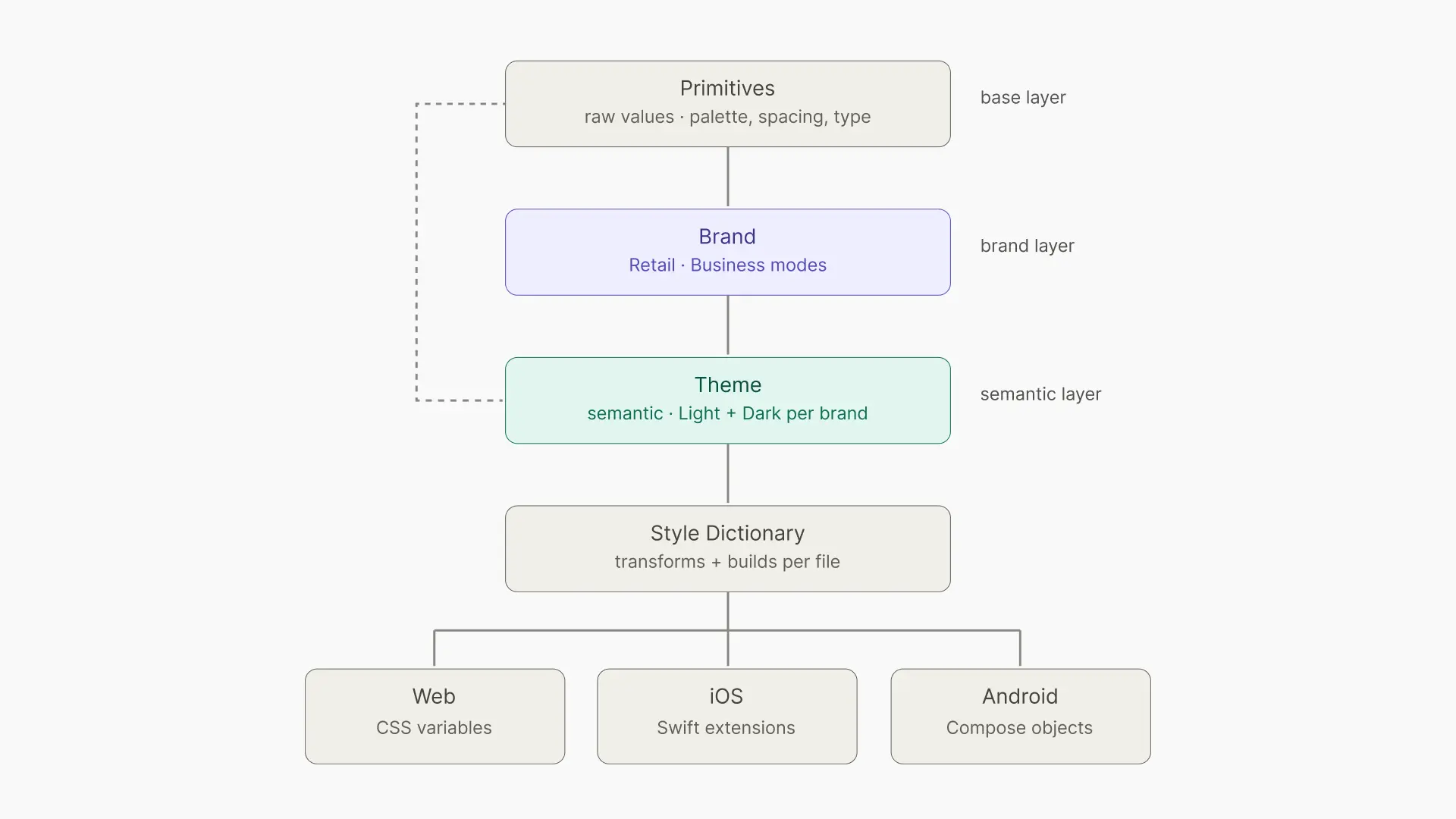
Each layer had a clear responsibility, and changes at any level cascaded appropriately without requiring manual updates across the system.
Solving dark mode properly
Previously there was no proper dark mode infrastructure in the system. Designers who needed to produce dark mode designs had to duplicate their work and manually swap colors throughout, which was time-consuming and inconsistent.
With Figma Variables and modes, we defined tokens once and let the mode handle the rest. Switching a frame from light to dark became a single toggle, with no manual color changes or hunting through layers.
.webp)
Getting the team on board
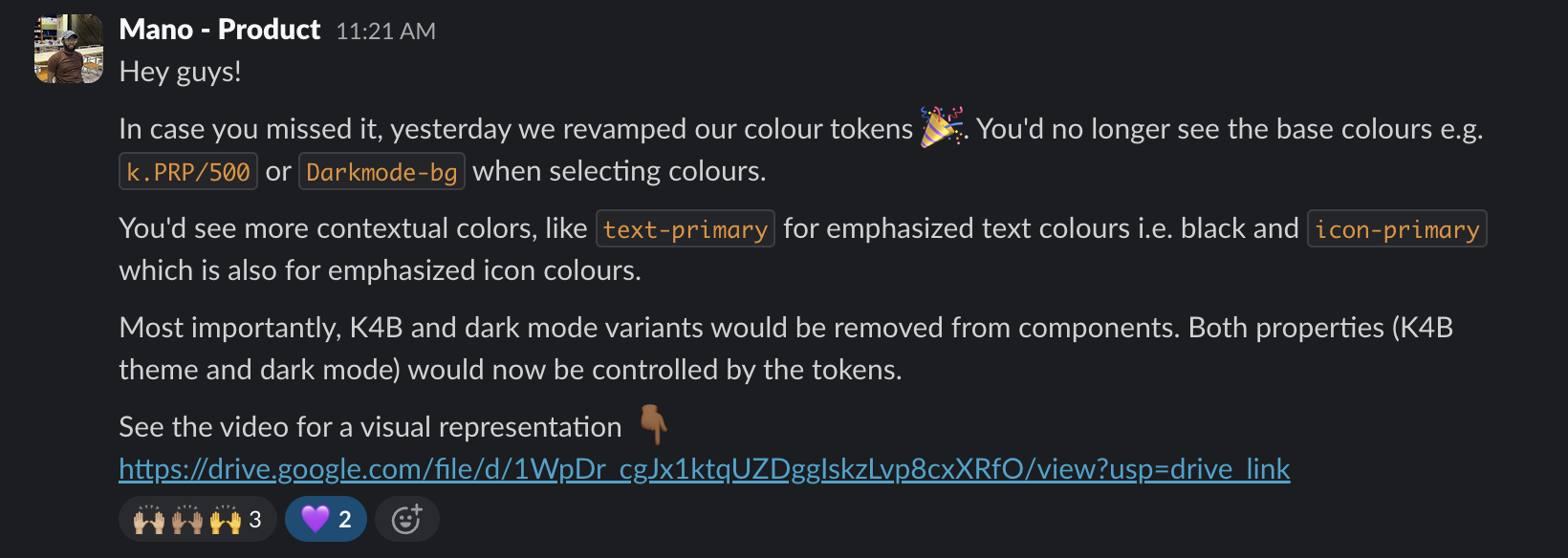
Shipping the system was only half the battle. We organized sessions with the full 15-person design team, walking through what design tokens are, how the architecture works, and most importantly, why it's structured the way it is. Understanding the reasoning made adoption feel like a sensible choice rather than an imposed change.
We also created documentation for the token system, giving designers a clear reference point for what each token is, when to use it, and why.
Results
Three months after rollout, we gathered feedback from the team. The response was strongly positive.
"It's so much easier to pick the colors I need."
"I love how I can switch to dark mode once I've applied the tokens."
The dark mode functionality was a standout win. What used to be a tedious, manual process was now a single toggle. But the more meaningful shift was in confidence. Designers stopped second-guessing color decisions. New team members had a clear path to follow. Experienced designers moved faster.
The tokens became a shared language, a common reference point that reduced ambiguity and made cross-team consistency achievable for the first time. Color token usage climbed from around 20% to over 70% across all teams, with consistent daily application.
What's Next
Design systems are never finished. Our current focus areas:
Developer adoption is the biggest open challenge. Designers have embraced the token system, but bridging it to engineering without manual coordination still requires work. We're exploring documentation improvements, token pipelines, and tighter engineering collaboration.
Full token coverage is still in progress. Color and typography adoption is strong; spacing and radius tokens are still catching up. We're focused on making those tokens as intuitive as the color have become.
Legacy cleanup is ongoing. Older components and screens still carry hardcoded values. We're working through them systematically, starting with the most frequently used files.
Reflections and take-aways
- Build on what exists. The strongest move wasn't starting over. It was recognizing what was already working and evolving it deliberately.
- Adoption is the real metric. A design system's success isn't measured by component count. It's measured by how confidently your team uses what you've built.
- Remove friction, not just add features. The dark mode toggle wasn't a technical breakthrough. It was friction removal. That distinction matters more than it sounds.
- Tokens are a shared language. When the naming is right, tokens stop being an abstraction and become a communication tool across teams, and eventually between design and engineering.